Microsoft
With the goal to develop a visual language, I wanted the icons to feel familiar. For this particular project, I pulled most of my inspiration from Microsoft’s brand alone.
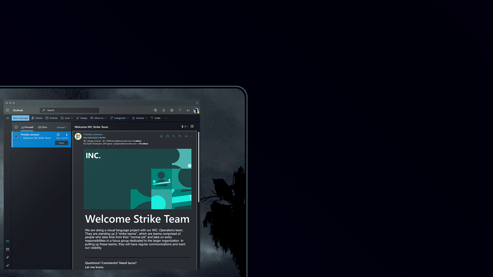
The final concept plays with different tints and layers. Each tint is placed upon one another to give a segmented gradient. In addition, inspired by the Office 365 icons. I began developing a few monochromatic palettes. That being said, the icons themselves utilize elements that are already familiar to users.